Recently I’ve been digging up data about smartphone use worldwide for a presentation and found out a few things that surprised me, let me share them. The data comes from several sources: TomiAhonen Almanac, IDC, Gartner, Statista. Exact references can be found at the end.
Quantitative data
From 2010–2014 the data comes from measurements, 2015—2019 is forecast data. Shipment data is the most accurate. I’ve extrapolated the usage data for 2015—2019 based on little information so take it with a grain of salt, if you know of more accurate predictions, let me know and I’ll update here.
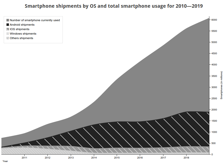
In short Android and IOS won, Windows has negligible market share, and Firefox OS doesn’t even show up in the data. The bump in Others before 2013 correspond to Nokia devices (running Symbian) and Blackberry, both disappeared. The dip in shipments in 2015—2016 is because of a market growth slowdown.
Mathemagic
This is interesting in itself but we can go further with the data. Let’s assume we treat smartphone usage like a subscription, every year you renew your subscription with your device, or not. Within that model we can use some math to get the attrition rate and deduct the average time a device is used before being replaced. Now over the first 4 years, Apple devices had a modest growth and their regular iPhone release allows us to check that the data and this calculation is not going all over the place.
The average life of an iPhone is 1 year and 3 months over the 2010–2014 period.
Looking good so far, as Wikipedia warns, getting the attrition rate for a fast-growing population doesn’t make sense and we don’t have ganular enough data to compensate. That sounds about right because if we calculate the average life of an Android device in the same time period, we get 3 months. Since the market is slowing down, we’ll have a better luck of calculating device life over the 2015–2019 period:
Over the 2015–2019 period the average life of a device:
- Android: 1 year and 1 month
- iPhone: 1 year and 5 months
This looks more reasonable. I don’t think Apple would want to slow down the release rate, getting their product a few months before christmas is pretty perfect timing so either one year they won’t release a new iPhone or get one out so bad most won’t want it (as if). Could be that my data is wrong too.
Qualitative data
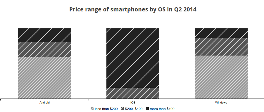
This is starting to explain explaining why Android devices exploded and why the churn rate will be higher than iPhones. Android and Windows devices are way cheaper.
Given Android marketshare 48% of all smartphones were sold for less than $200 in 2014.
Future price data is only available for 2017 where the average price of a smartphone will be $265 globally. One curious fact is that while average smartphone prices drops everywhere below $300 in north america price goes up to $567. Americans would probably be optimist enough to think that they’ll all be rich and buy only high-end smartphones, I just think they’ll get milked by vendors.
Conclusion
All this data will be put to good use in the next post. All of this was compiled to have data to go along with my mobile javascript rant and how $10 smartphones are actually really important to the web.
References
Where the data comes from as well as interesting related pages.
- Smartphone Year 2014 Final Stats: Brand Top 10, OS Top 4, Installed Base, Regional Split; and Bloodbath Q4 Results (Updated)
- Smartphone Bloodbath 2010: Now Final Numbers Q4 and Full Year 2010 - and each rival awarded their final grades
- Final Q4 Numbers and Full Year 2012 Stats for Smartphone Market Shares: Top 10 Manufacturers, Top OS Platforms, Top Installed Bases (Revised & Corrected)
- Lets Understand the Mobile Phone Market, installed base and smartphones vs dumbphones
- Worldwide Smartphone Market Will See the First Single-Digit Growth Year on Record, According to IDC
- Global Smartphone Growth Expected to Slow to 11.3% in 2015 as Market Penetration Increases in Top Markets, According to IDC
- Worldwide Smartphone Growth Expected to Slow to 10.4% in 2015, Down From 27.5% Growth in 2014, According to IDC
- How Smartphone Prices Differ Across Platforms
- Forecasted unit shipments of smartphones worldwide in 2014 and 2018 (in million units), by operating system
- Global smartphone shipments forecast from 2010 to 2019 (in million units)*
- Smartphone unit shipments worldwide from 2013 to 2015 (in million units), by region
- Gartner Says By 2018, More Than 50 Percent of Users Will Use a Tablet or Smartphone First for All Online Activities
- Churn rate
2015-12-08: Updated
Updated total smartphone usage data based on Ericsson Mobility Report data. It’s a little optimistic but the shipment data combined with the average device lifespan supports the 6 billions number.